
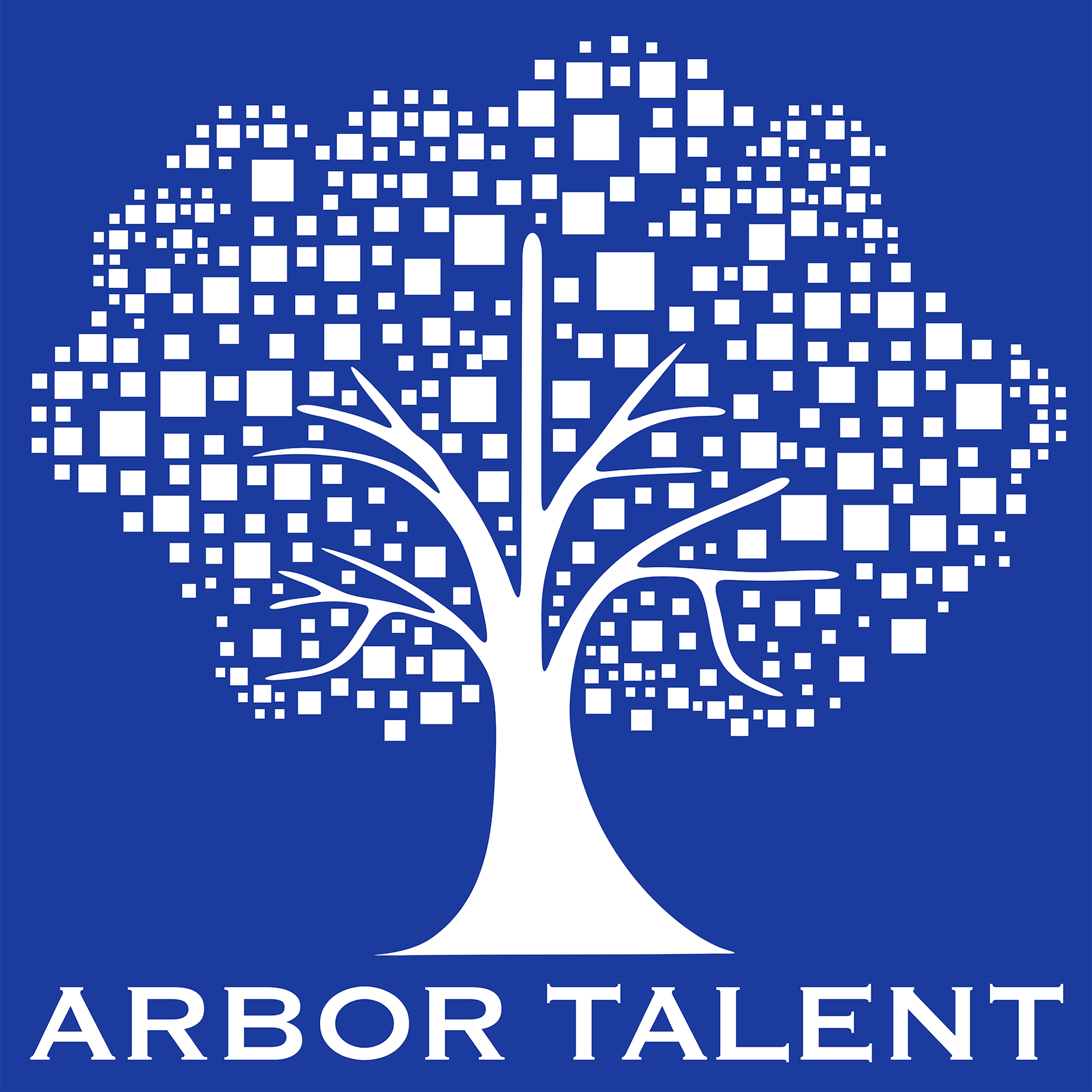
Arbor Talent was founded by Jen Rhee, a top HR professional consulting with national and international brands to built teams. In no way a "square," Jen had always considered it her signature shape. A University of Michigan graduate who still lived near Ann Arbor, Jen wanted to incorporate her alma mater's name, which mean tree, and to "Go Blue."
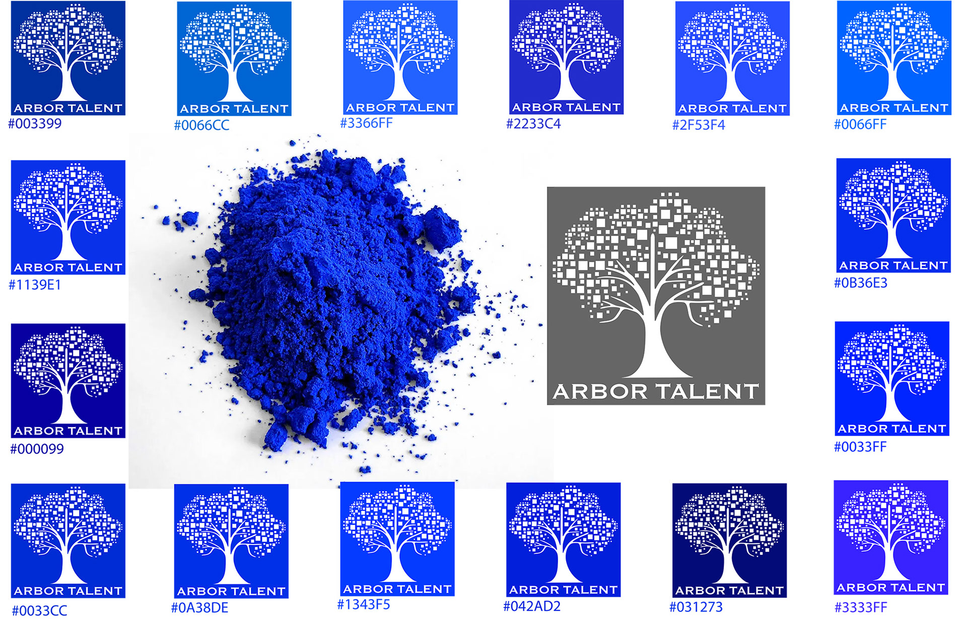
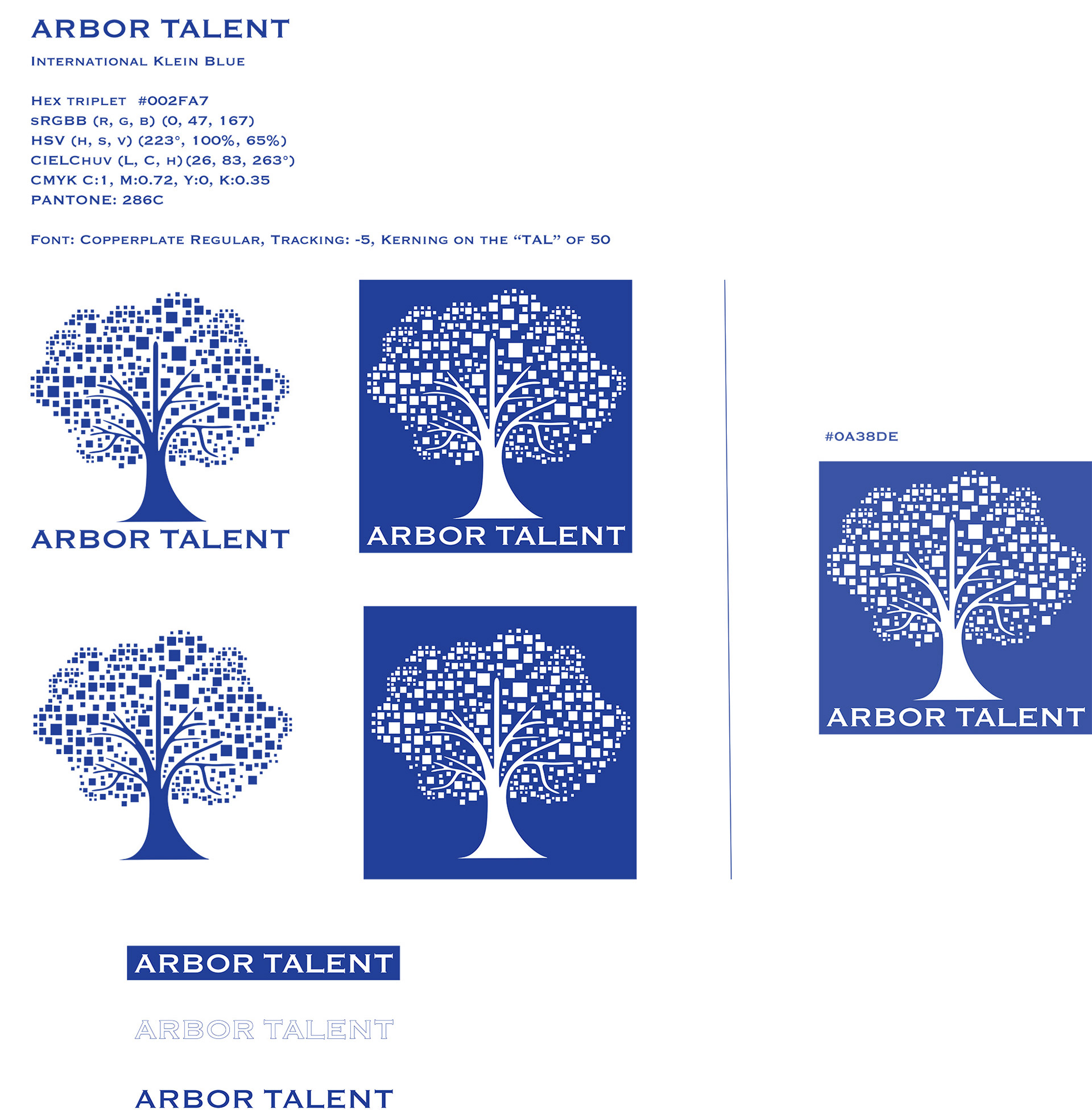
Then last step in designing the Arbor Talent logo was selecting the blue that best communicated Jen's goals. She wanted something professional and calming but also energized. Jen loved UltramarineBlue, famous a Klien Blue or International Blue, so we explored many versions eventually choosing a slighlty muted version. Electric – but dressed to impress too.
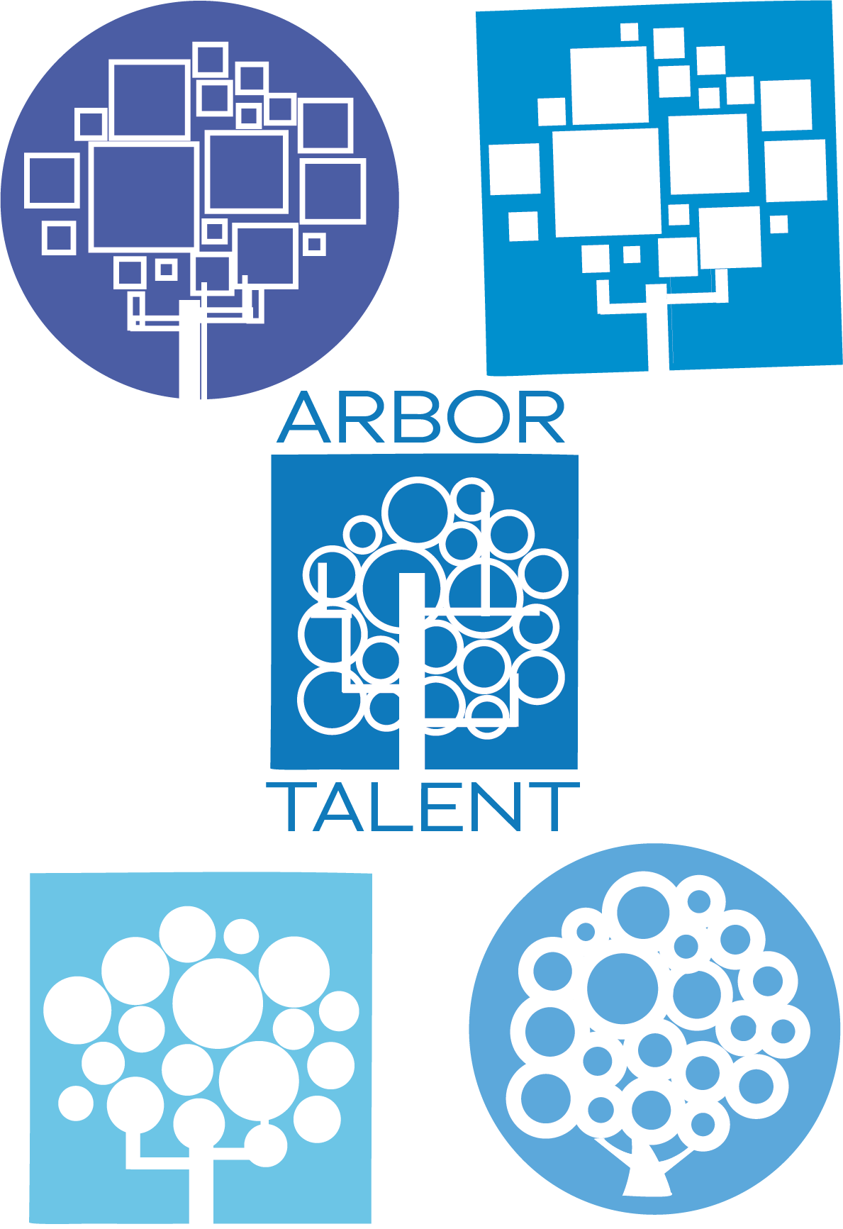
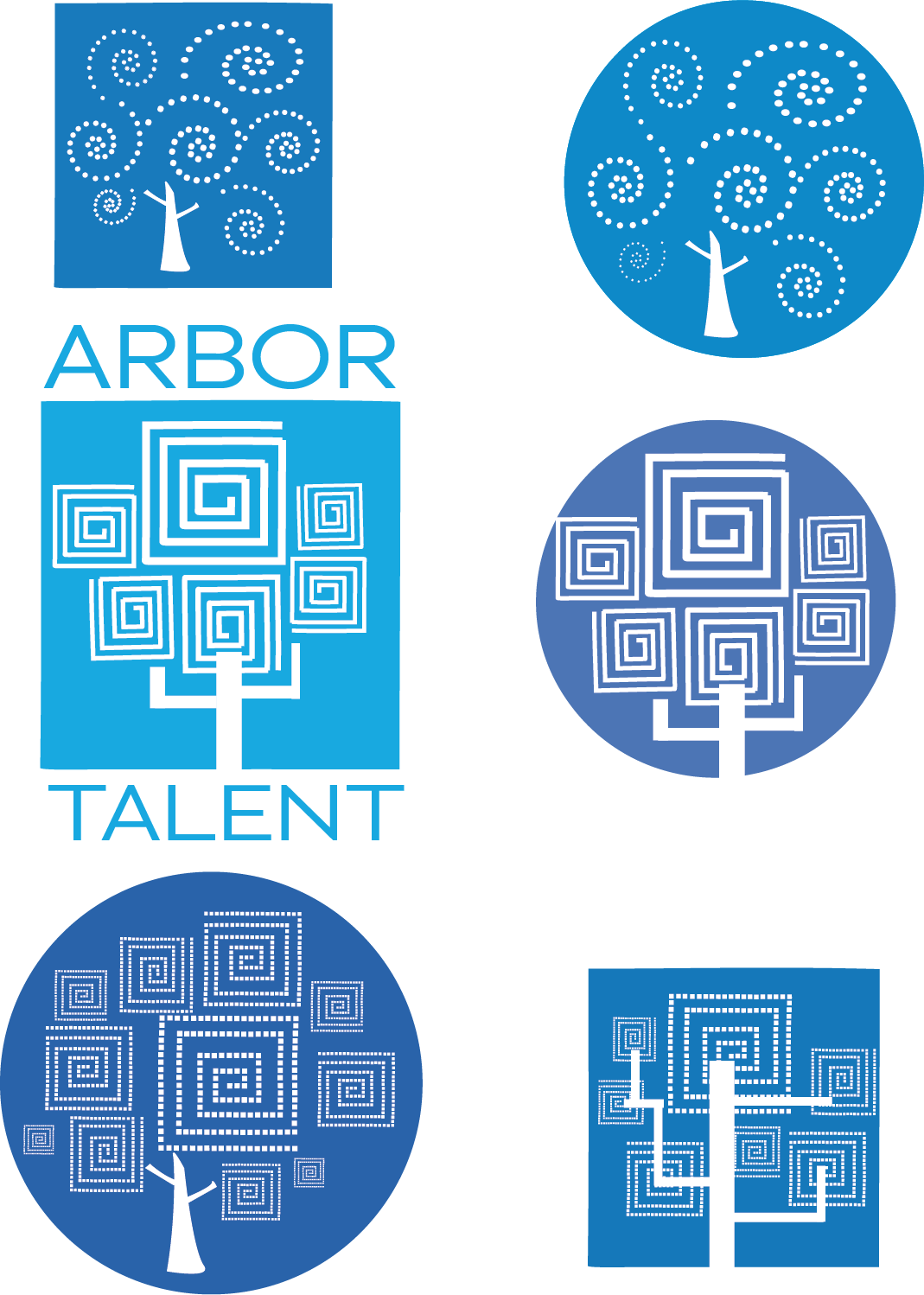
After the hand sketch round, Jen and I discussed what was working and what wasn't and moved the ideas we liked into Adobe Illustrator to clarify some of the ideas and begin playing with color.

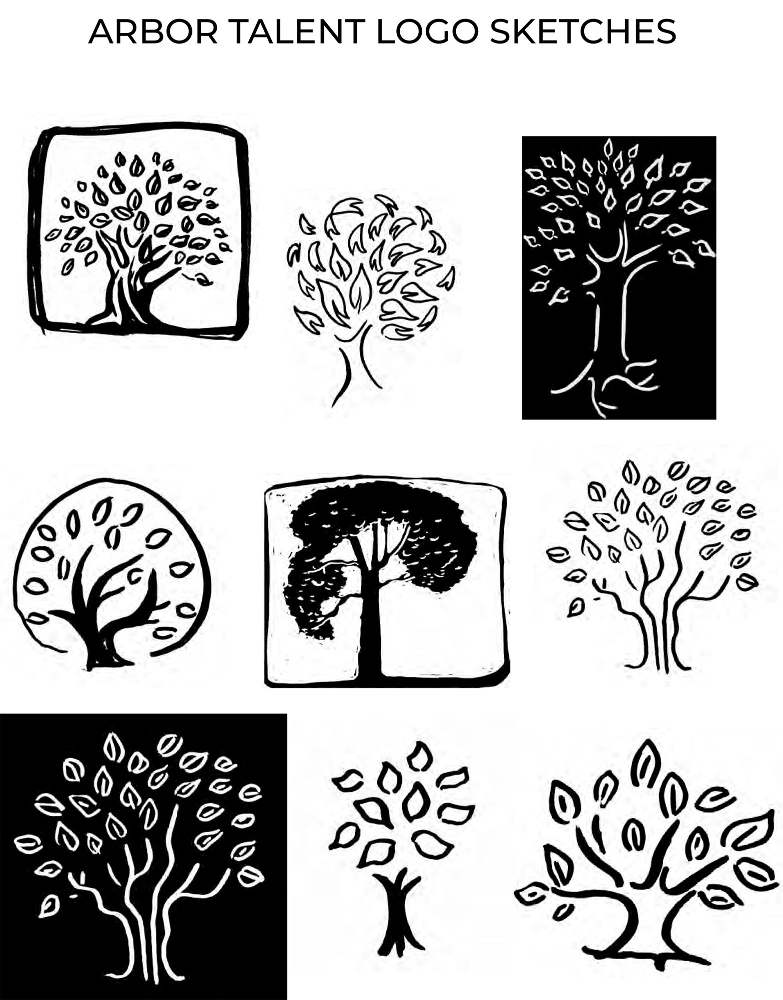
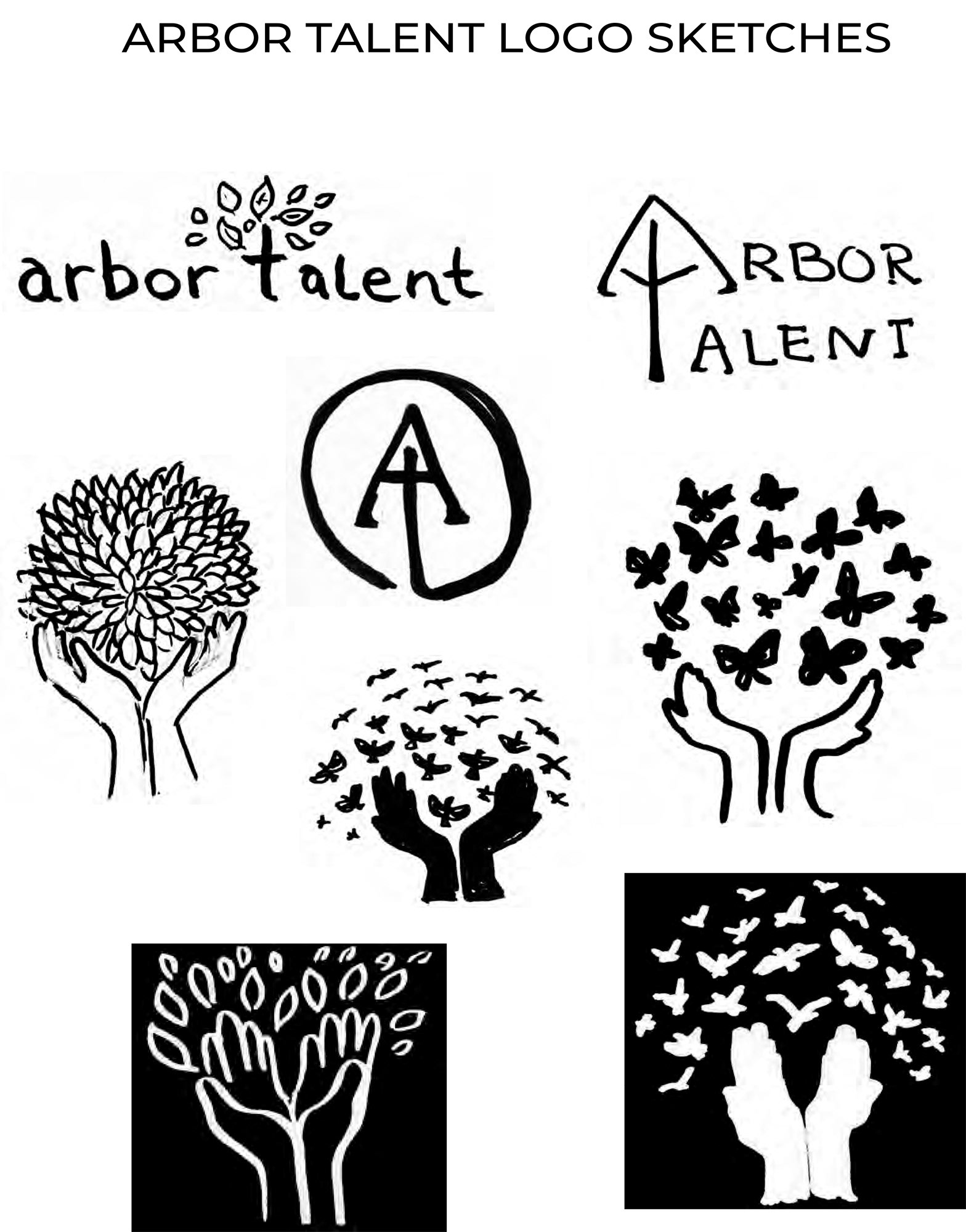
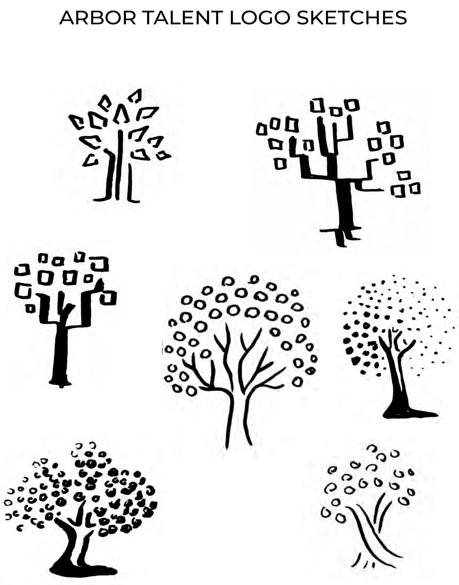
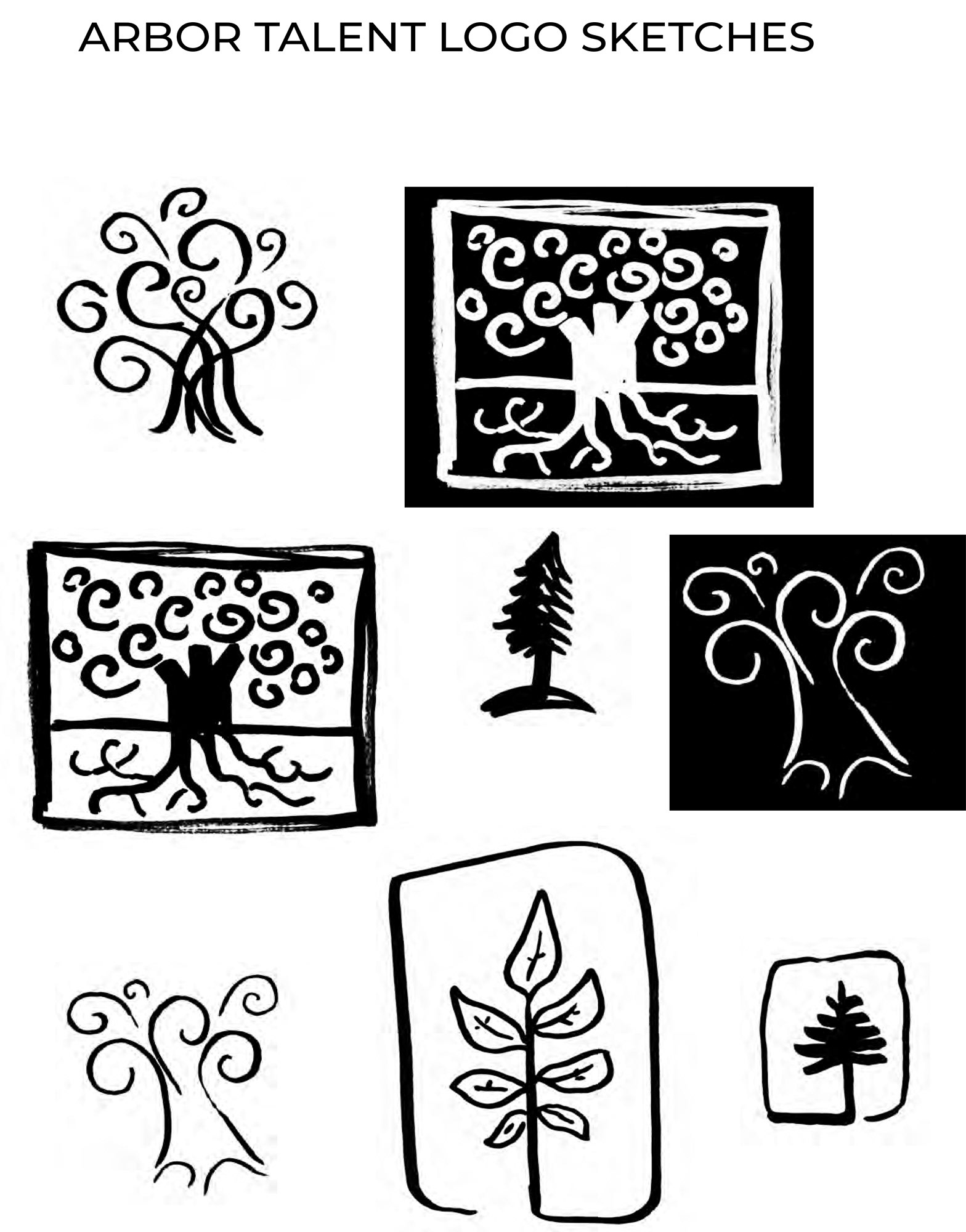
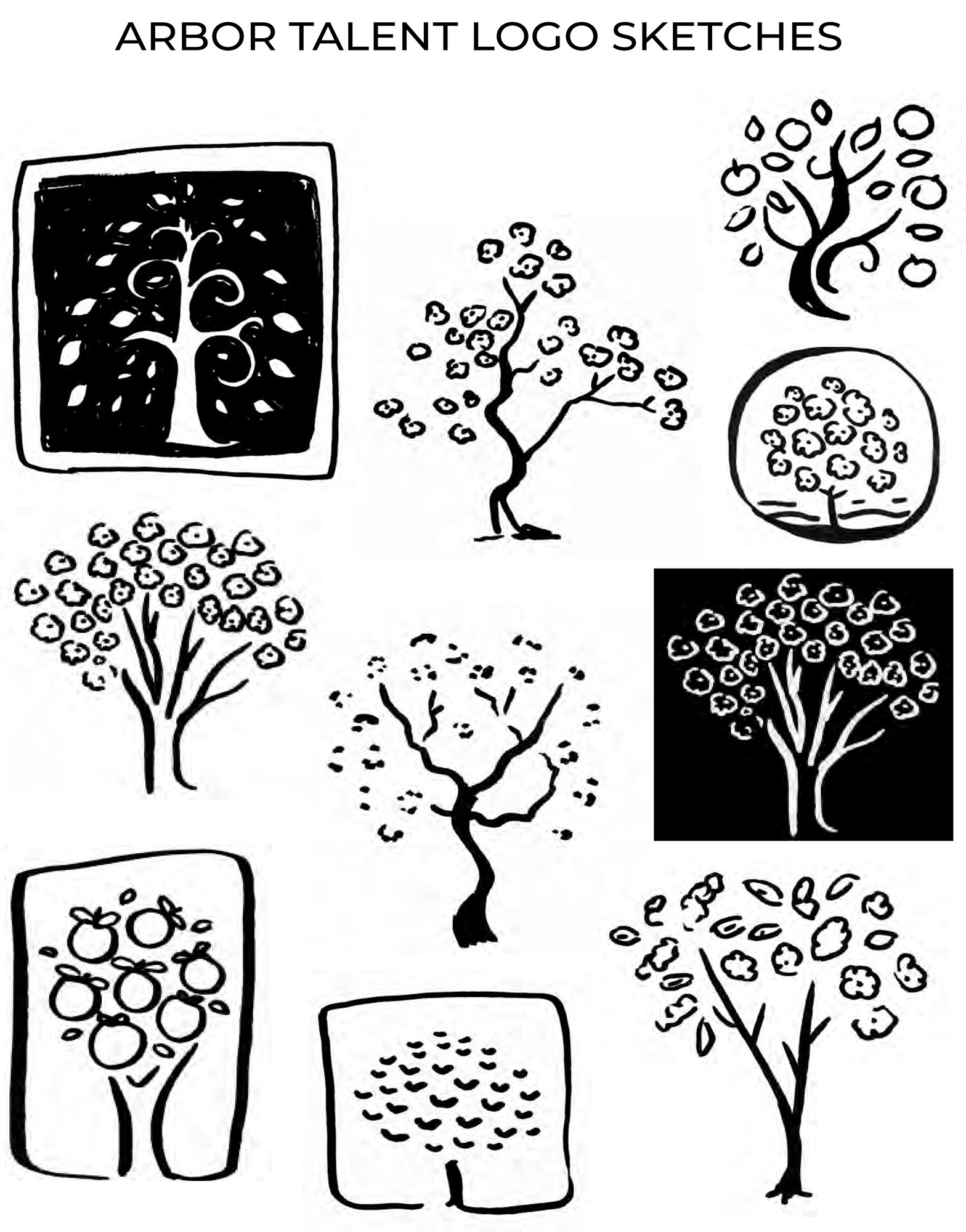
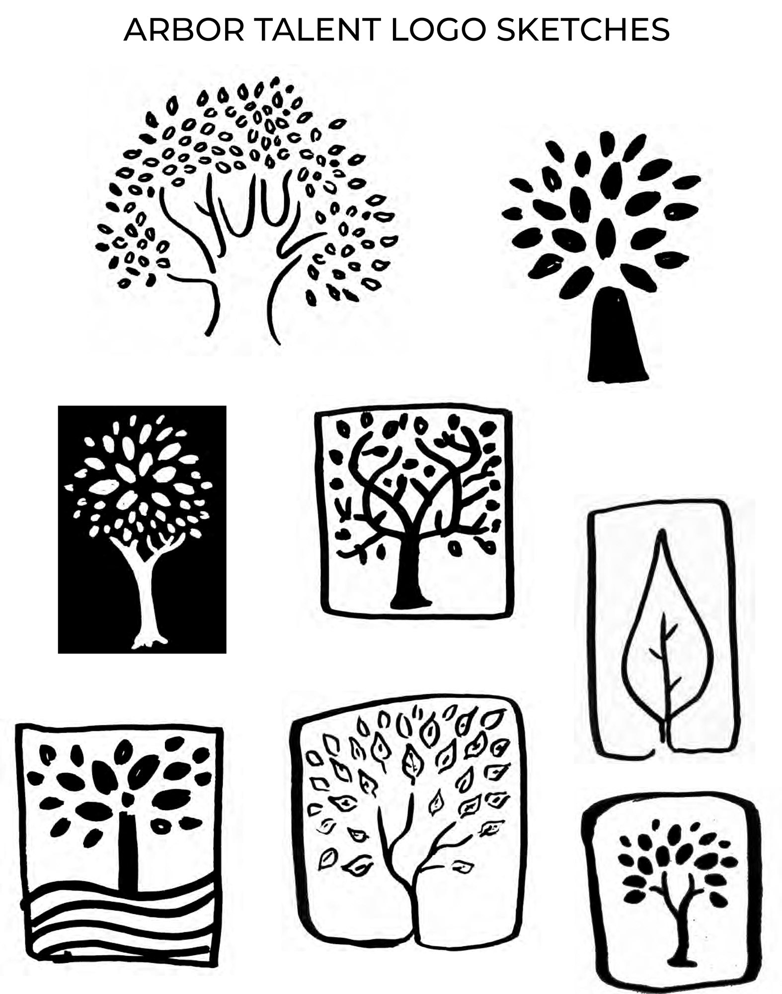
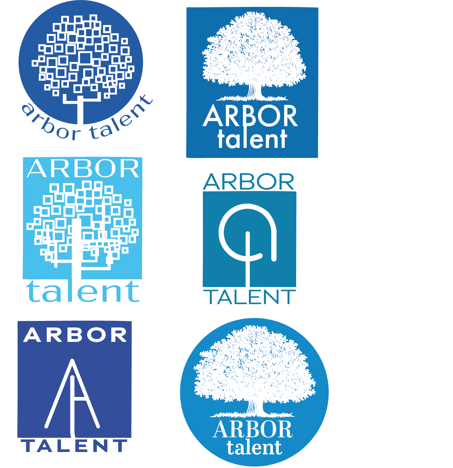
After brainstorming and researching ideas, I sat down to sketch, sending Jen the ideas that seemed like they could work. From these sketches, we decided on a few directions to explore in greater detail.
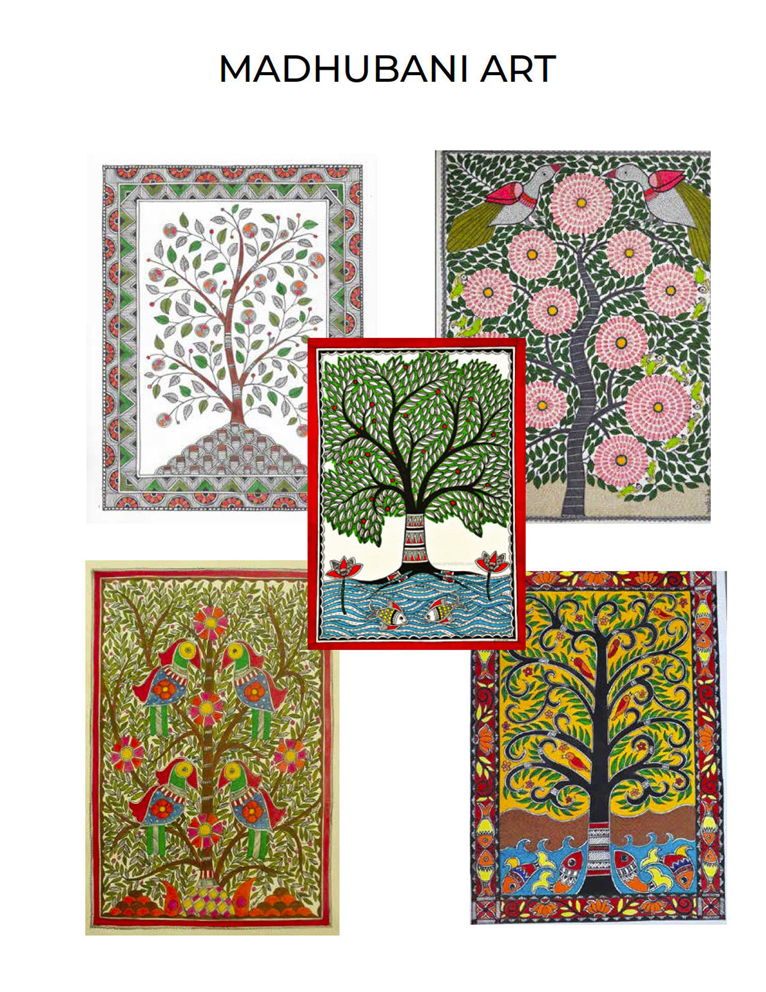
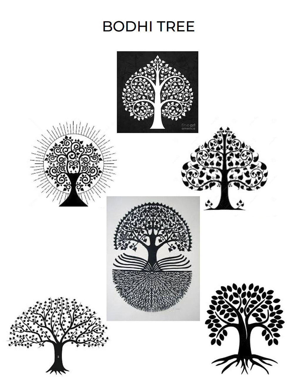
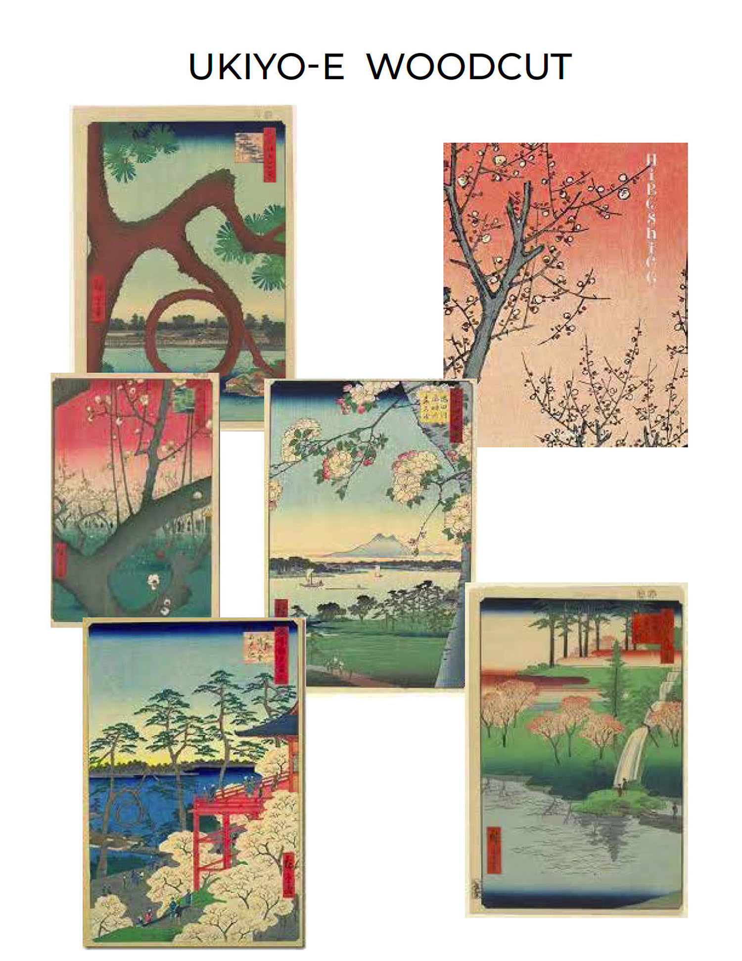
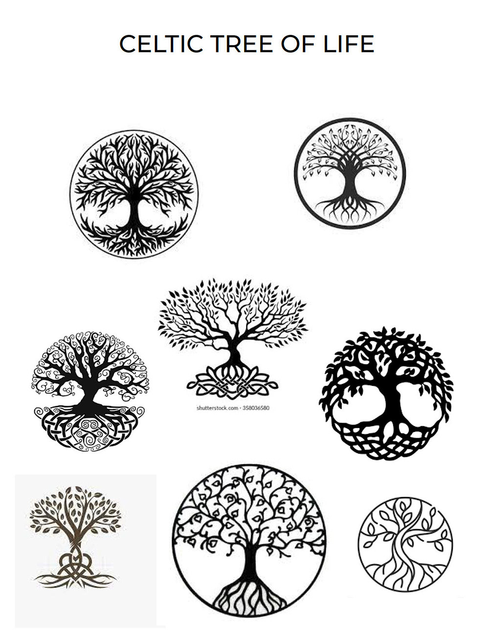
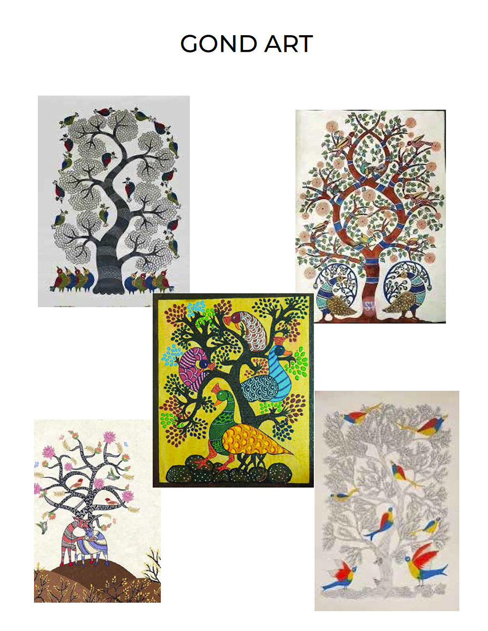
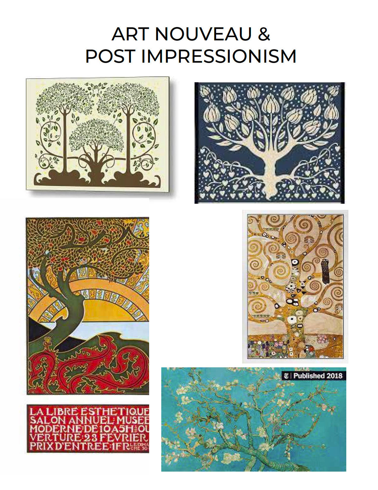
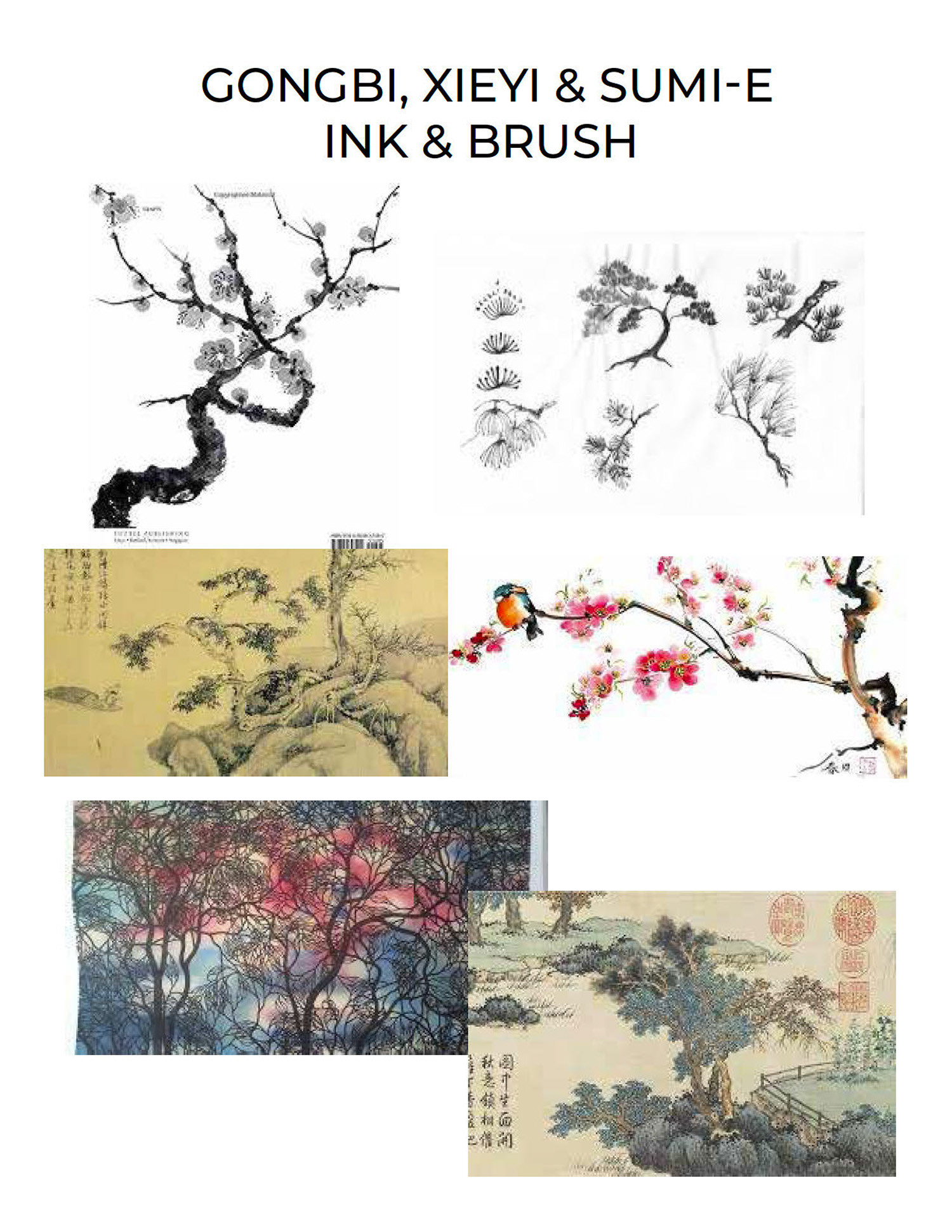
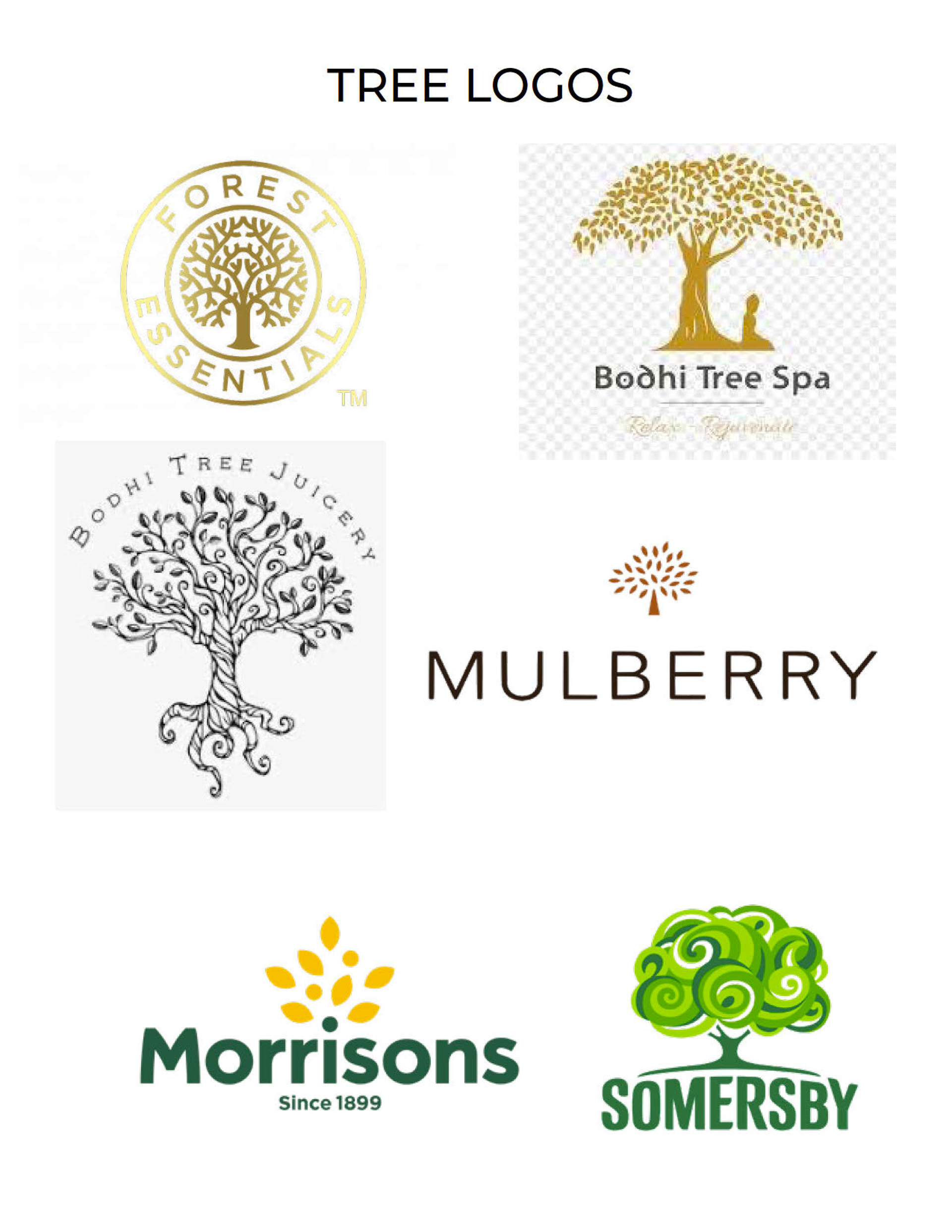
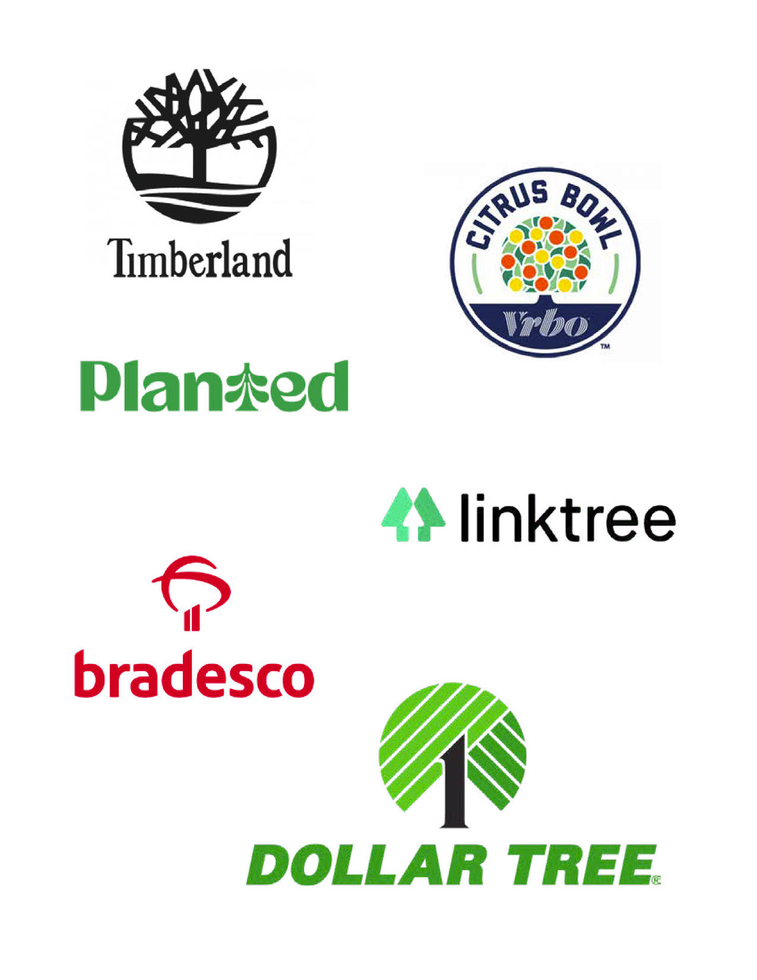
Jen loved the name Arbor Talent not only because she loved her alma mater University of Michigan but also because the idea of a tree and of organic growth fit with her vision for growing companies by carefully selecting the best team members. After our initial brainstorming, we looked to art history, a rich source of tree iconography and cultural meaning. We also explored what tree logos we liked – or felt weren't as successful.